Stats are boring. Graphics are fun! Creating custom iconography and infographics involves a lot of careful consideration to really help the client’s message shine. From custom iconography that can be used throughout marketing pieces, to completely custom-illustrated infographics, I can create the perfect visual package to communicate your message.
Angel Funder's Report 2020 Infographic
Angel Capital Association is a trade association for angel investors. Each year, they produce The Angel Funder's Report, a research report detailing trends and analysis of the angel investor community. The report has includes this companion infographic.
Angel Capital Association Pillar Icons
Angel Capital Association is a trade association for angel investors. They provide educational resources and networking opportunities for their members, in four main categories, or "pillars": Education & Smart Practices, Data Analytics & Insights, Community Networking, and Public Policy. We decided these individual focus areas needed their own brand look, for use in emails and other marketing materials. To do this we assigned a color to each pillar, plus a customized icon. Members who receive communications will be able to identify at a glance which pillar that communication is associated with.
Petcare Safety Window Cling
Petcare Animal Hospital is a member practice within the Encore Vet Group network. They were gifted free printing and needed a window cling to communicate to clients the new safety practices for pet dropoffs during the COVID-19 pandemic. I used the same illustration style I've used for all Encore pieces. This is clear and concise and I think it turned out well.
Encore Vet Group Let's Work Safely Infographic
My longtime client Encore Vet Group, Encore Vet, a company who buys into existing vet practices and then offer them educational and operational support as they grow, requested this informational document to help their practices safely work through the COVID-19 pandemic.
IAAO 2019 Year-in-Review
Since 2017, I've designed a yearly infographic detailing growth and changes in their organization for the International Association of Assessing Officers (IAAO. It's set up as a folded poster stitched in to their monthly magazine. This year, I was inspired by a fabric design I saw in a clothing catalog. The design is loose and casual, with a fun visual vibe.
IAAO 2018 Year-in-Review
Since 2017, I've gotten to design a yearly infographic detailing growth and changes in their organization for the International Association of Assessing Officers (IAAO). It's set up as a folded poster stitched in to their monthly magazine. In 2018, I was in the mood for rich colors and layered shapes. I love the way this turned out -- it is professional, but the visuals really pull the reader from one section to another.
IAAO 2017 Year-in-Review
The International Association of Assessing Officers (IAAO) produces a yearly infographic detailing growth and changes in their organization. It's set up as a folded poster stitched in to their monthly magazine. Using colorful isometric illustrations as a jumping-off point, I designed this to build on a look and feel they've been transitioning to. The result is an engaging, visually exciting piece that guides the reader through the story of IAAO and 2017.
The full version of this graphic can be viewed here.
The full version of this graphic can be viewed here.
Encore Vet Group Inventory Graphic
Encore Vet Group is a company who buys into existing vet practices and then offer them educational and operational support as they grow. This graphic is meant to show the way Inventory Management and Cost of Goods Control are integral to a practice. Color coding helps designate which practice members are responsible for individual action items.
Encore Vet Group Iconography
Encore Vet Group is a company who buys into existing vet practices and then offer them educational and operational support as they grow. I developed this iconography (and am continually adding to it) for them to keep their marketing and internal documents consistent and eye-catching.
Pryor Learning Solutions Iconography
When Pryor Learning Solutions rebranded, they came to me looking to take the new identity and infuse it into their marketing materials. To that end, I created a custom iconography playing off the "broken" circle surrounding the mark of the new logo. The set includes 32 icons with new ones created as necessary.
Boelte-Hall Iconography
When Boelte-Hall, a Roeland Park, KS-based printer, rebuilt their website, they came to me for a complete brand refresh including business cards, letterhead, etc. As part of that project, I created this custom iconography, centered around their apple logo. These icons can be used within the hexagonal design system that is used throughout their identity and marketing materials.
Byrne Pelofsky + Associates Giving 2018 Infographic
This was the third year I worked on this project for Byrne Pelofsky + Associates Giving 2018 Infographic. This graphic illustrates the findings of their yearly report on philanthropy in the United States. The client requested a playground/community theme for 2018. I thought it turned out quite fun.
The full brochure version of this graphic can be viewed here.
The full brochure version of this graphic can be viewed here.
Jeffrey Byrne + Associates Annual Giving 2017 Infographic
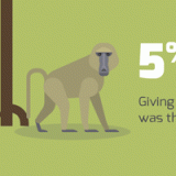
This was the second time I worked on this project for Jeffrey Byrne + Associates. This graphic illustrates the findings of their yearly report on philanthropy in the United States. When the client suggested a Safari theme, I jumped right in! I think it turned out really fun and engaging.
The full brochure version of this graphic can be viewed here.
The full brochure version of this graphic can be viewed here.
Jeffrey Byrne + Associates Annual Giving 2016 Infographic
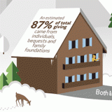
This was a really fun project to work on. Jeffrey Byrne + Associates needed an infographic to illustrate the findings of their yearly report on philanthropy in the United States. Because growth was the story, I suggested a theme of "Reaching New Heights" and played off of the owner's love of skiing. The color scheme is taken directly from the company's brand.
A larger version of this graphic can be viewed here.
A larger version of this graphic can be viewed here.
Advanstar Infographic Marketing
This infographic was created for a media company focused on the Veterinary industry. Their sales team was selling a program creating custom infographics in marketing campaigns, and they hired me to create a custom infographic to market it!
A full-size version of this graphic can be viewed here.
A full-size version of this graphic can be viewed here.
The American Angel 2018 Infographic
This infographic was paired with a research report exploring the backgrounds of American Angel Investors titled "The American Angel." I was given basic PowerPoint-created charts and completely rebuilt each one from scratch to match the aesthetic of the report. Select charts were pulled to build this infographic.
A full-size version of this graphic can be viewed here.
A full-size version of this graphic can be viewed here.
License! Global Reach Infographic
This infographic was used to illustrate the global reach of License! Magazine, through print, digital, web, and e-mail. This infographic is a combination of icons and custom-created illustrated graphics.
Boelte-Hall Facebook Infographics
As part of a general refresh in website and identity materials, Boelte-Hall, a Roeland Park, KS-based printer, stepped up their engagement on Facebook. These infographics were custom-created to be used as cover photos on their Facebook page. I created these using provided stats and strictly stuck with their brand colors to create a really cohesive look.


