Web design has come a long way in a short time – and I’m always learning new technology to keep up. I specialize in WordPress websites built on the Genesis Framework – a system that gives clients flexibility and control over their site. My web know-how extends to web marketing, including HTML e-mails, banner ads in all sizes and variations, cover photos, etc.
The CVC Website
The CVC is a veterinary conference that happens three times a year in various cities around the U.S. Their old website was a tangled mess that was impossible for users to navigate. I started at square one and built this site from the ground up using the Genesis Framework on the Wordpress CMS. The site is clean, adheres to the existing CVC brand, and is easy to update as shows open for registration. The site also features highly searchable grids of all content for each show.
Railway Service Contractors Website
Railway Service Contractors is a small business that offers a range of services to the locomotive industry. Their site was designed to put the locomotives front and center.
railwayservicecontractors.com
railwayservicecontractors.com
Deborah Broide Publicity Website
The client, Deborah Broide Publicity, requested a website that reflected the simplicity of her logo. The result was a lovely, clean website that complements her business's existing aesthetic.
http://deborahbroidepublicity.com
http://deborahbroidepublicity.com
Prairie Pediatric Dentistry Website
Prairie Pediatric Dentistry needed a website that was professional, but still fun and approachable. Using the logo I designed as a starting point, the website has a calm, neutral color palette but with fun details like a crayon-style wavy line along the footer. This site was built on the Genesis framework for Wordpress.
ppdkansas.com
ppdkansas.com
Synergie, LLC Website
Synergie, LLC is a consulting company specializing in veterinary practice. Given only the logo, I was tasked with creating a clean, easy-to-navigate site that highlights immediately the specific services the company offers. I chose to use the blues of the logo as a jumping off point to create this airy, simple site, which was built on the Genesis Framework using the Wordpress CMS.
www.synergie-llc.com
www.synergie-llc.com
TallulahBelle's HTML Email Template
TallulahBelle's is a Leawood, Kansas boutique specializing in handcrafted art, sculpture, jewelry, and accessories from artists around the country. The owner has a generally cohesive marketing look, but her emails stuck out as clunky and unattractive. I designed an email template to better fit into her overall aesthetic, with a navigation to her site, large splash image, and modules to help promote various messages each month.
Pressure Cooking Made Simple eBlast
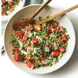
Pressure Cooking Made Simple was released in Spring 2015 with a coordinated marketing campaign that included this eBlast, which goes to all Cooking Light Magazine's e-mail subscribers. The design is a cleaner version of the book interior with a lovely, eye-catching food photo that makes recipients want to start cooking.
Beach House Happy eBlast
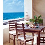
Beach House Happy was released in Spring 2015 with a coordinated marketing campaign that included this eBlast, which goes to all Coastal Living e-mail subscribers. It's nice and simple, with a gorgeous interior photo and watercolor accents to add texture.
Mad Delicious eMarketing
Mad Delicious (which has since won a James Beard Award) was released in Fall 2014 with a coordinated marketing campaign that included print ads (which I also worked on) and a variety of eMarketing projects, including an eBlast, Twitter Badge, and both static and rotating banner ads in a variety of sizes.
VPI Banner Ads
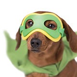
Every year, Veterinary Pet Insurance (VPI) hosts a Practice Manager of the Year contest and reception at the CVC veterinary conference. For 2015, I proposed using a "Super Dog" theme to go with their "Tell Us How Your Manager's SUPER" marketing copy. After finding (or creating) the proper photos, I designed the ads and other marketing collateral to have a bright, graphic, comic book-inspired look. This one of the most fun projects I've worked on. And, the client liked the concept so much they used it in promotion of their other products!
The CVC Banner Ads
Every year, veterinary conference The CVC runs a variety of banner ads to promote the show to potential attendees and exhibitors. I handled creating these ads for several years. The project would entail three standard banner ad sizes designed as both rotating and static, which promoted a variety of messages to different audiences, which routinely added up to over 40 ad variations.

